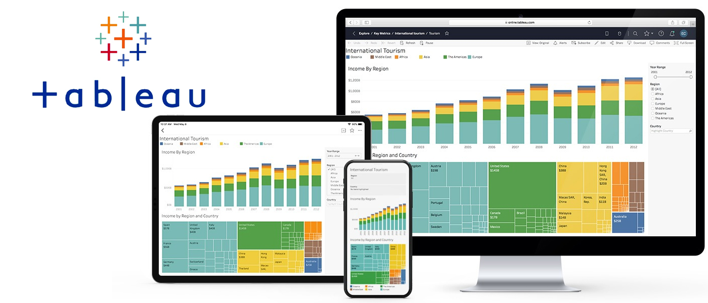
Tableau Training
Tableau Training Syllabus
Introduction and Overview
- Why Tableau? Why Visualization?
- Level Setting Terminology
- Getting Started creating some powerful visualizations quickly
- The Tableau Product Line
- Things you should know about Tableau
Getting Started
- Connecting to Data and introduction to data source concept
- Working with data files versus database server
- Understanding the Tableau workspace
- Dimensions and Measures
- Using Show Me!
- Tour of Shelves (How shelves and marks work)
- Building Basic Views
- Help Menu and Samples
- Saving and sharing your work
Analysis
Creating Views
- Marks
- Size and Transparency
- Highlighting
- Working with Dates
- Date aggregations and date parts
- Discrete versus Continuous
- Dual Axis / Multiple Measures
- Combo Charts with different mark types
- Geographic Map Page Trails
- Heat Map
- Density Chart
- Scatter Plots
- Pie Charts and Bar Charts
- Small Multiples
- Working with aggregate versus disaggregate data
- Analyzing
- Sorting & Grouping
- Aliases
- Filtering and Quick Filters
- Cross-Tabs (Pivot Tables)
- Totals and Subtotals Drilling and Drill Through
- Aggregation and Disaggregation
- Percent of Total
- Working with Statistics and Trend lines
Getting Started with Calculated Fields
- Working with String Functions
- Basic Arithmetic Calculations
- Date Math
- Working with Totals
- Custom Aggregations
- Logic Statements
Formatting
- Options in Formatting your Visualization
- Working with Labels and Annotations
- Effective Use of Titles and Captions
- Introduction to Visual Best Practices
Building Interactive Dashboard
- Combining multiple visualizations into a dashboard
- Making your worksheet interactive by using actions and filters
- An Introduction to Best Practices in Visualization
Sharing Workbooks
- Publish to Reader
- Packaged Workbooks
- Publish to Office
- Publish to PDF
- Publish to Tableau Server and Sharing over the Web
Putting it all together
- Scenario-based Review Exercises
- Best Practices
Tableau Online Training Course Content:
Introduce Tableau.
Products of Tableau
- Tableau Desktop
- Tableau Server
- Tableau Public
- Tableau Online
- Tableau Reader
Getting Started
- What is Tableau? What does the Tableau product suite comprise of? How Does Tableau Work?
- Tableau Architecture
- What is My Tableau Repository?
- Connecting to Data and introduction to data source concepts
- Difference between Live connection & Extract
- Dimensions and Measures
- Data Types and properties
- Tour of Shelves (How shelves and marks work)
- Marks Card
- Using Show Me!
- Building Basic Views
- Saving and Sharing your work-overview in Tableau Public
Working with Data
- Join
- Multiple Table Join
- Self-Joining
- Working with Custom SQL
- Connecting Multiple data source (Data Blending )
- Difference between joining and blending data, and when we should do each.
Analysis -1
- Cross tab
- Bar Charts
- Line Graphs
- Pie charts
- Heat Map
- Scatter Plots
- Tree Map
- Bubble Graph
- Blended Axis
- Dual Axis
- Edit axis
- Totals & Subtotals
- Replacing data source
- Edit Alias of fields
Analysis -2
- Filters
- Quick Filter
- Context filters
- Top/Bottom N
- Actions
- Highlights
- URL
Analysis -3
- Sorting
- Ref lines
- Trend lines
- Discrete vs Continuous
- Forecasting
- Replace data source
- How to call image in worksheet
Analysis – 4
- Grouping
- Bin
- Hierarchies
- What is set
- View data
- Bins/Histograms
- Drilling up/down – drill through
- Actions (across sheets)
Parameters
- Create What-If analysis
- Using Parameters in
Maps
- Explain latitude and longitude
- Default location/Edit locations
- Custom Geo Coding
- What is open street map
- What is WMS server
Calculated Fields
- Working with aggregate versus disaggregate data
- Explain - #Number of Rows
- Basic Functions (String, Date, Numbers etc.)
- Usage of Logical conditions
Table Calculations
- Explain scope and direction
- % total, running calculations etc.
Building Interactive Dashboards
- Combining multiple visualizations into a dashboard (overview)
- Floating
- Tiled making your worksheet interactive by using actions.
Advance Charts
Histogram Chart:
Histograms are one way to display the distribution of values in a field. We can create a histogram by binning the values of a measure and then creating a view based on the measure and its binned values.
Water Fall Chart:
These charts are mainly used to identify how each and every value is contributing the total value. It is the great way to compare sequential value contribution on the total cumulative. These can be used to find Inventory and performance analysis.
Bump Chart:
These are used to compare one dimension based on the other dimension. Bump charts are usually reports the boat race, each boat tries to move front and bump the other boats.
Funnel Chart:
The text mark type is useful when you want to display the numbers associated with one or more dimension members. This type of view is often called a text table, a cross-tab, or a Pivot Table
Advanced Geo Mapping:
Plotting Maps based on detailed Latitude, Longitudes, Plot Order, and Polygon Maps.
Tableau Server
Tableau Server Architecture.
- Installation and configuration.
- Add Users to the Server
- Add Users to a Site
- Add Users to a Group
- View, Edit and Delete Users
- Change Site Roles
Real Time Exercises Follows
Tableau Training Full Course Content : Download Here
Our Courses
- AWS Online Training
- Hadoop Online Training
- Devops Online Training
- Tableau Online Training
- Informatica Online Training
- ServiceNow Online Training
- ReactJs Online Training
- BlockChain Online Training
- Salesforce Online Training
- Datascience Online Training
- Selenium with Python Online Training
- Selenium with Java Online Training
- Core Java Online Training
- SharePoint Online Training
- Sql Server Developer Online Training
- MSBI (MicroSoft Business Intelligence) Training
- Oracle DBA Training
- Pl Sql Developer 11g\12g Online Training
Testimonials
What are they saying


